Gretchen Albrecht: Between Gesture and Geometry
In 2019, Gretchen Albrecht – Between Gesture and Geometry, published by Massey University Press, was launched at Auckland Art Gallery Toi o Tāmaki. Written by Luke Smythe, it is a monograph of Gretchen Albrecht, whose dedicated practice has enriched and illuminated our country’s art for over 60 years.
The Gallery holds at least seven of Albrecht’s major works, including Aotearoa – Cloud, 2002, and Gains and Losses (Father – Red), 1998, and has held two solo exhibitions over the years: Seasonal/Four Paintings (1985–86), and Gretchen Albrecht: Illuminations (2002).
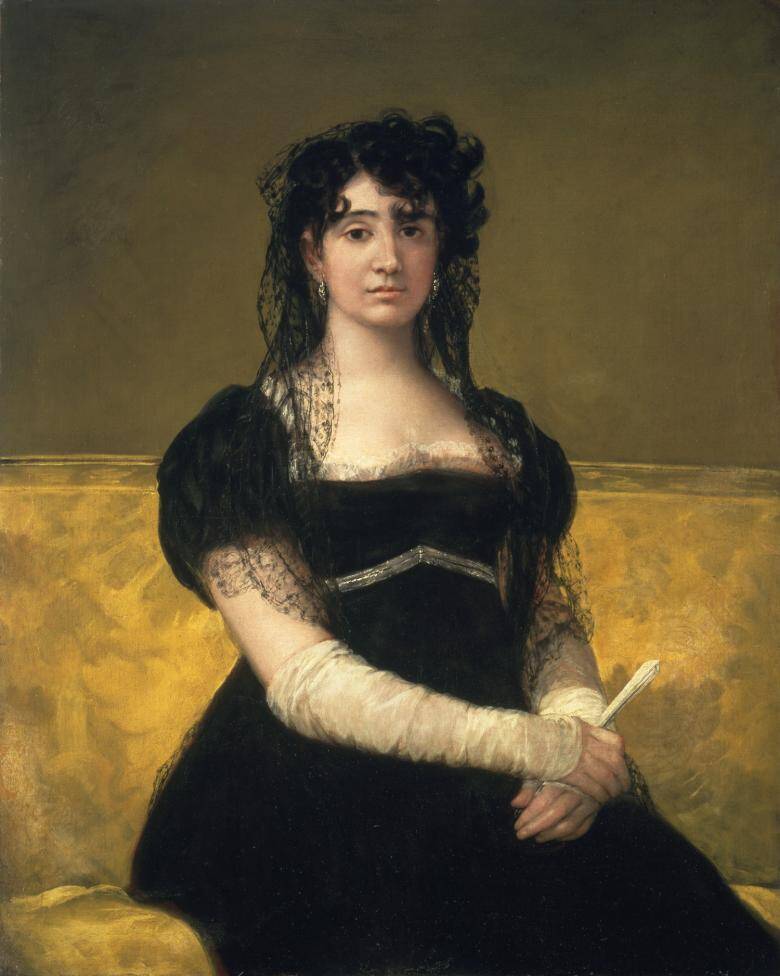
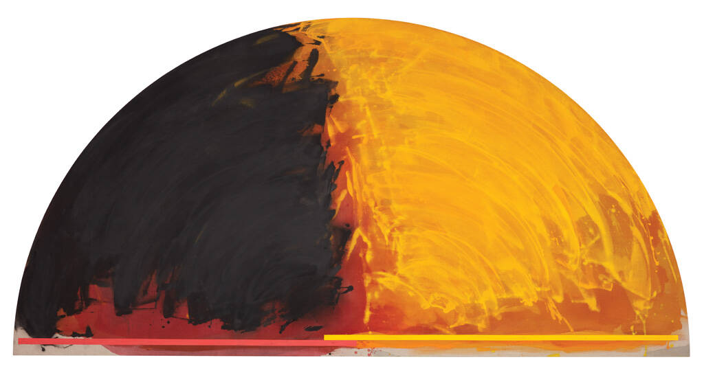
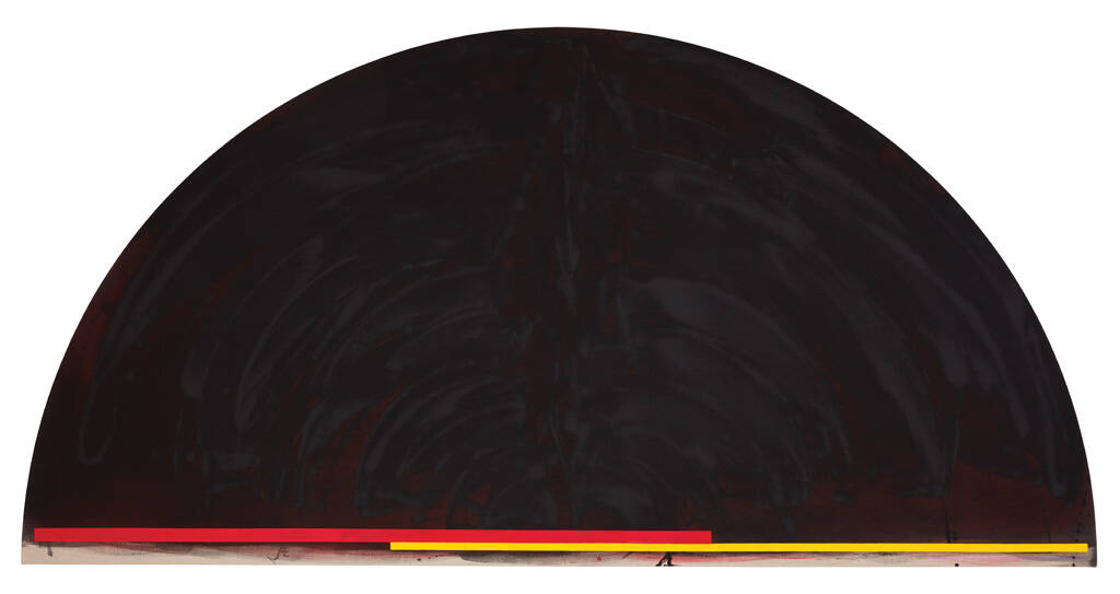
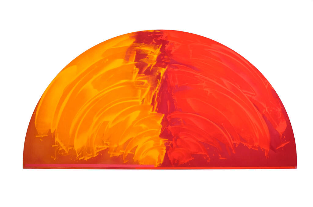
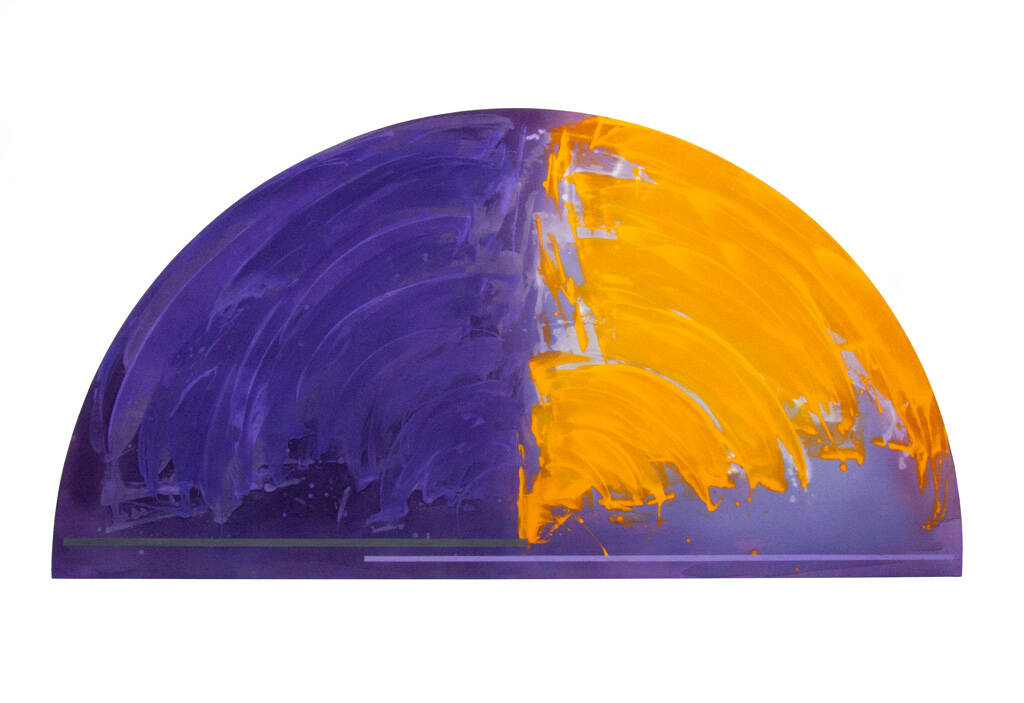
The Covid years, with their insistence on solitude and containment, prompted Gretchen to reconsider themes and structures in her work from the perspective of a painter with a long view. During those years, she completed two suites of paintings: After Goya, 2020, four large hemispheres ‘talking’ to four portraits by Goya, which reaffirmed her kinship with the Western art tradition, and Eight Hours, 2019–21, a meditation on the eight hours of the Divine Office, prayers sung throughout day and night in monasteries since medieval times which honour time’s eternal present.
The significance of these series was recognised by author and publisher, and in 2023, a revised edition of the monograph with a new cover and a final evocative chapter, ‘Time’s Measure’, was launched at Two Rooms Gallery.
Catharina van Bohemen spoke to Gretchen Albrecht about working with Luke Smythe, how she paints, and the importance of After Goya and Eight Hours.
CvB: How did the idea for a monograph come about, and what part did you play in its development?
GA: For about four or five years when he was a university student, Luke was my technical assistant and got to know my work intimately. He began by going through boxes of 35 mm slides and set up a digital database for my archive. Gradually, he became more technologically expert, and I also got hold of better images of my paintings. For instance, if one came up for auction, or we knew somebody who owned a work, we sent a photographer to record it. Nikki, my present studio assistant, still works on that archive today.
Luke suggested the monograph and that he’d like to do it. He also seemed the right choice. He'd looked at my work for so long – his parents own a ‘hemisphere’ which has always hung in their various houses; he'd written essays for New Zealand journals and catalogues; and when Jamie [Gretchen’s husband, artist James Ross] and I went to America in 2000, and took a show to a dealer gallery, he wrote the essay for that.
I gave him access to whatever he wanted. He looked at my paintings in storage which holds work from 1963 to now. He went through all my archive boxes, my correspondence, my studio notebooks; in fact, whatever he wanted.
How much a part do I play in the book? Well, how long is a piece of string? Obviously, when he was writing, I wasn't breathing over his shoulder. His writing about the Illuminations series, 1977–78 is incredible. They are not my words but his. I loved what he found and how he wrote about it. He surprises me with his readings and interpretations.
Part of the aim of my recent show, Lighting the Path at Two Rooms (November–December 2023) was to bring the 45-year-old Illuminations paintings, which I’d painted before going to Europe in 1978, into focus with the work I produced in 2023, to see correspondences and how the language I established long ago is still used for new sentences now. There were enormous shifts after being in Europe, and when I came back, those paintings didn’t seem relevant. That’s why they remained rolled up. But that's good, because if I hadn't gone away, and had exhibited them, they’d all be scattered – not seen as this core group that I saw when I unrolled them two years ago.
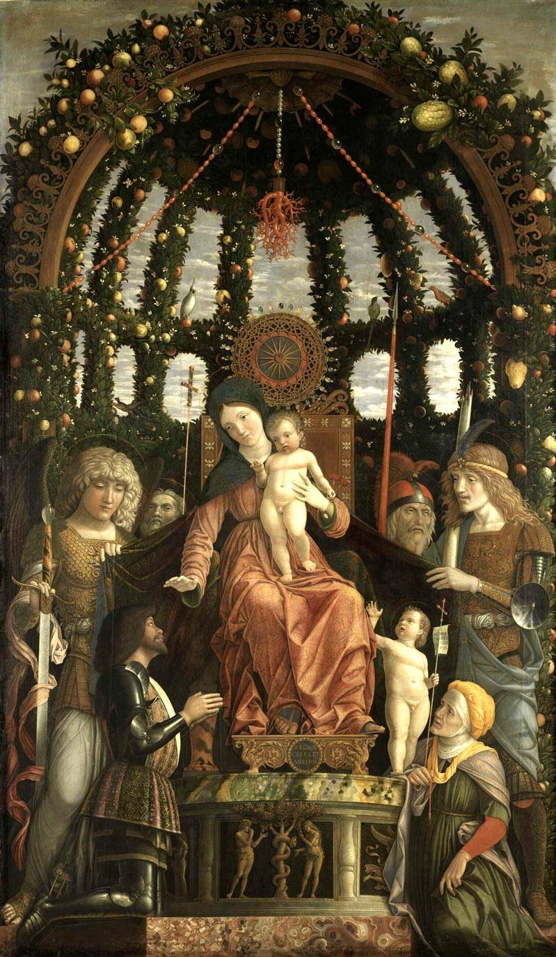
I played a part in the book that any person being written about would play with her author. If Luke said something that I felt needed fleshing out a bit, I might say, for example, ‘Well, we were walking through the Louvre in 1980, and suddenly I saw Mantegna’s Madonna della Vittoria with this amazing garlanded arch above her. And I’d said to Jamie, “This must have just arrived in the Louvre!”’
It hadn’t. It had been there for years. It was invisible to me until I needed to see it.
So we shared some of those things. Luke might send something he’d written to me, but never for my approval. I didn't try to direct him; he looked and understood. He writes about the work, and the threads of me and my life that are there, but they don't become the main thing.
The monograph was first published in 2019 – the year before Covid. At the end of that year, my brother, who makes my stretchers, had made four large undivided hemispheres. Then Covid came. I was alone in my studio with time to work and read. As I told Julia Waite, who wrote the catalogue essay for After Goya, 2020, I got out my Goya books, including a catalogue of an exhibition I’d seen at the National Gallery in London in 2015, which had made a deep impression on me. I already had a 20-year-old postcard of his Antonia, 1805, pinned up in my studio, after seeing her portrait at the National Gallery of Ireland in 2000. She started it all!
I like sequences, and the four hemispheres allowed me to look at four portraits by Goya. I could see four paintings of women ‘talking’ to each other, united by colours, textures and fabrics. At the end of 2020, I exhibited these After Goya paintings in a specially constructed room at Michael Lett Gallery so you could feel these connections.
And there are my Eight Hours, 2019–21 paintings – my largest series – based on the eight hours of Divine Office, which are prayers that monks have sung since medieval times throughout the day and night. I’d begun them in 2019, and during our two lockdowns, I completed them. My Eight Hours celebrate the days, the seasons, the years. To consciously mark time gives enormous significance to observing the world. Monks are between two worlds – they observe this one and are within a spiritual one.[1] They are lovely, quite extraordinary. I am so thrilled that the After Goya and Eight Hours series are included in the updated monograph. I'm so grateful.
These two series are very important to me. That’s partly why we reprinted the monograph: to include Luke’s writing about them. He wanted to concentrate only on After Goya and the Eight Hours: in their sequence with the pages unfolding as they do. I think it's a really huge ending.
The subtitle of the book’s title is ‘Gesture and Geometry’. Can you talk about the shapes of your canvases over your 60 years of painting?
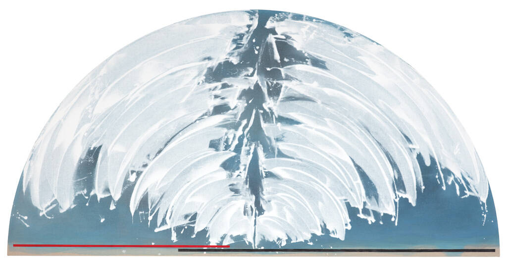
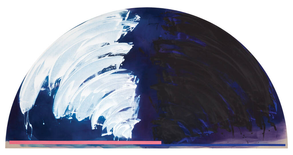
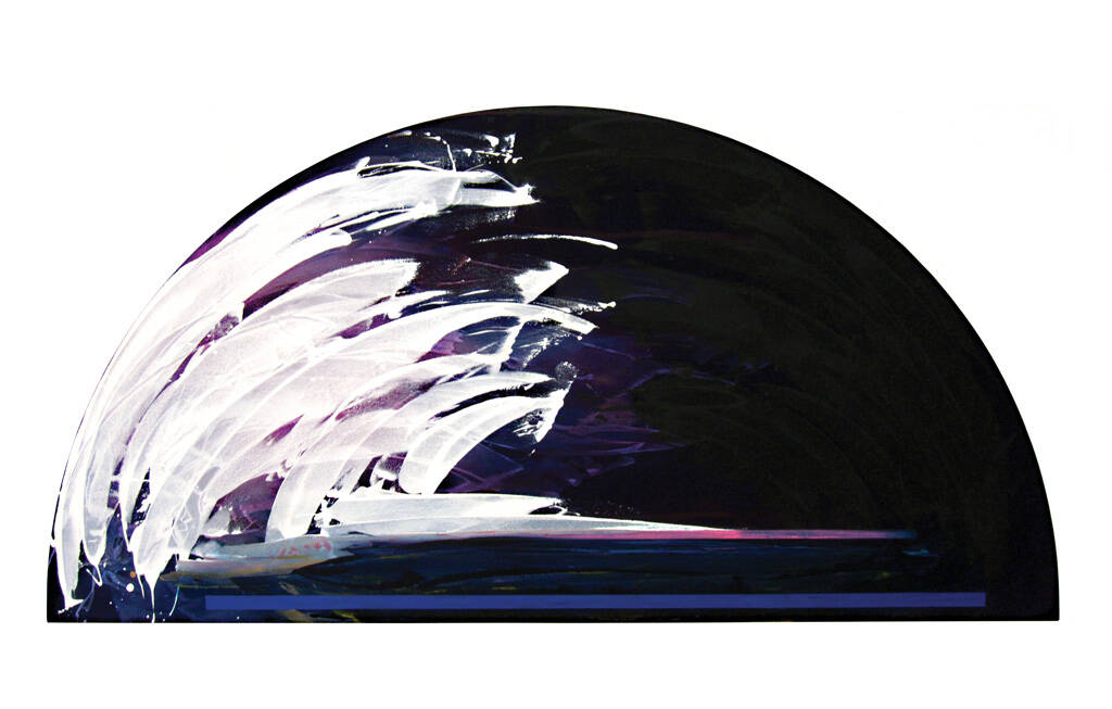
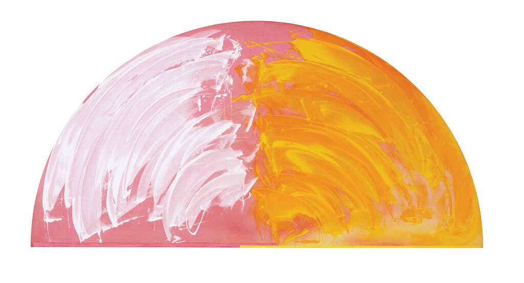
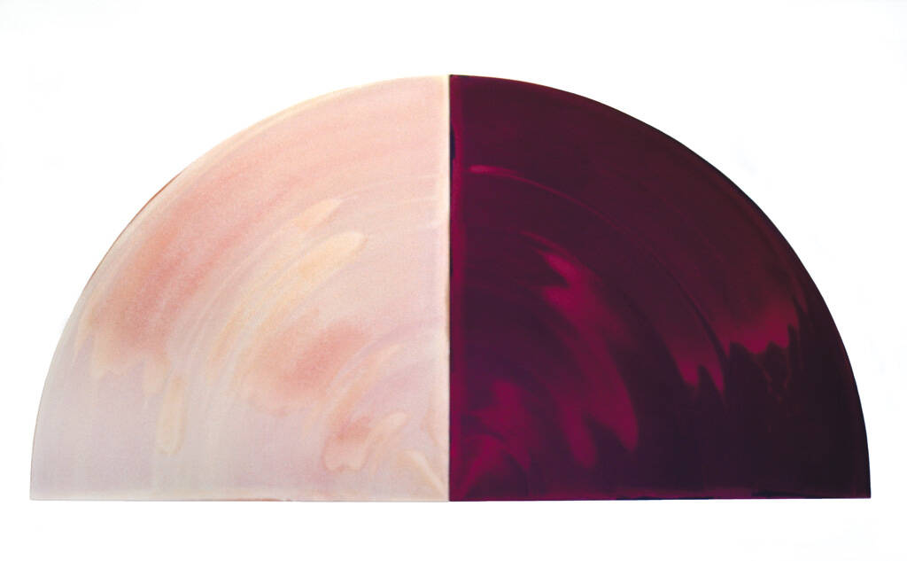
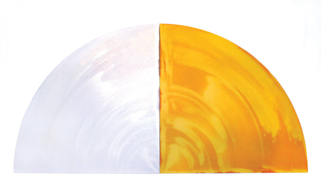
It's very clear how the hemisphere came about. It's architectural: from Romanesque churches we visited in Europe. But the hemisphere didn't just happen. When I came home, I felt different. I wanted something different to what I’d left behind. At first, I worked on rectangles because that's what I had. Then one day I banged a nail in the corner of the stretcher and tied a string and got a curve. I liked that. And then I thought, what if I take the curve to the outer edge? I got Dad to make some quadrants.
That led to my joining two squares together and doing the same for both sides. I had the semicircle! But it took a year to get there. When I saw the semicircle within the two rectangles, I realised, ‘This is what I'm interested in – curves! I'm not interested in corners at all!’ Once I’d got rid of the corners, I could fill that space up with what I wanted. Whether it was recognised by other people or not, I didn't care. I knew I had something. I did those in 1981. It wasn't a clear road. But all this helps: what you discard, and what you go with.
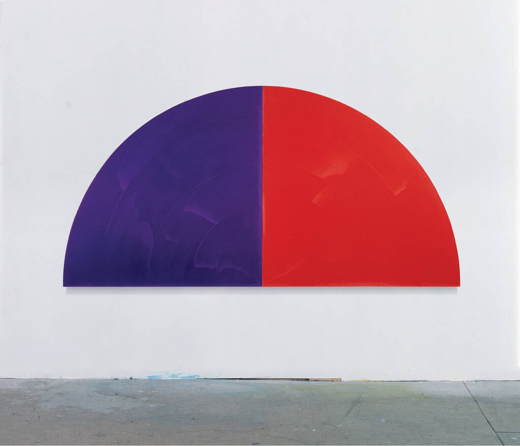
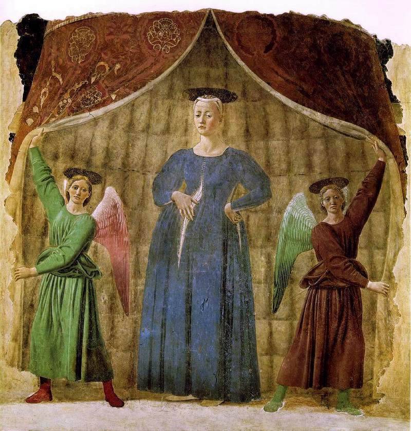
Next thing, I'm off to Dunedin for the Frances Hodgkins Fellowship thinking about the hemisphere: its shape and what I could do within it. The first hemisphere was Cardinal, 1981. It’s based on Piero della Francesco’s painting The Flagellation of Christ, circa 1455–65. In the background, a man, possibly Pontius Pilate, sits on a chair, watching. He's a church man, he wears a red and blue tunic, and he's got little red slippers peeping out. Also, the cardinal bird is red and blue, and cardinal is a prime number.
But, I’d just come back from Europe. I’d seen Piero’s fresco Madonna del Parto, 1460 in Monterchi. That painting is my Ur-image, or my foundational image. She stands within a fur-lined circular tent, its sides held open by a pair of angels who reveal the blue gowned Madonna pointing to her unbuttoned dress and her pregnant belly. The tent has a curved top folding into the curved Romanesque architecture and that prompted my sense of the shape’s intensifying the experience of looking and understanding. It presented the image to me – made it become visible – through the fabric of the structure. A perfect containment for such revelations.
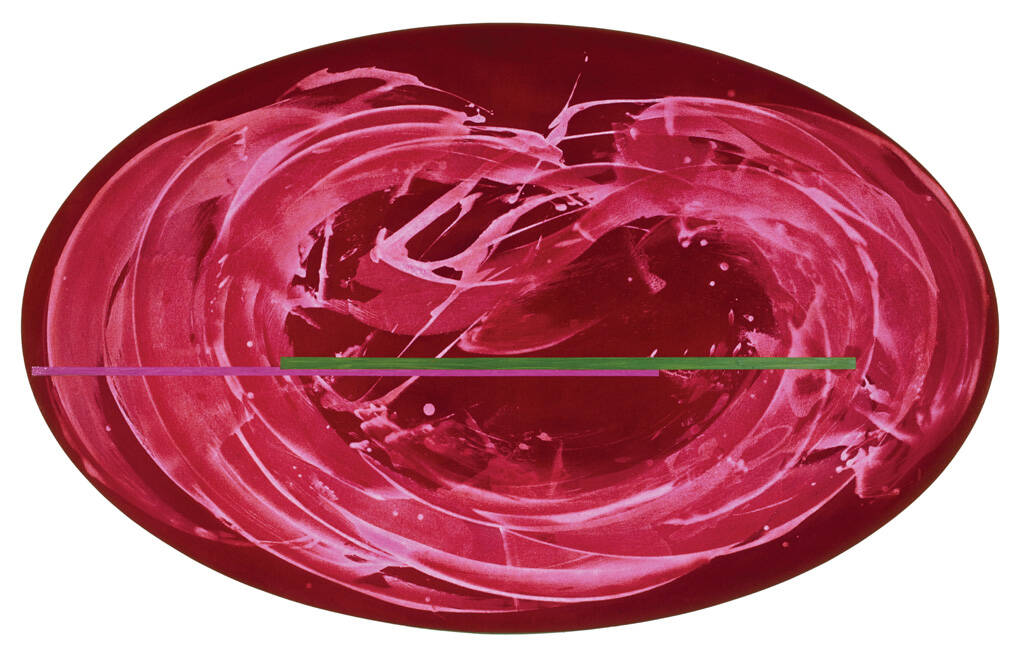
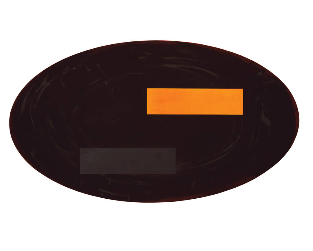
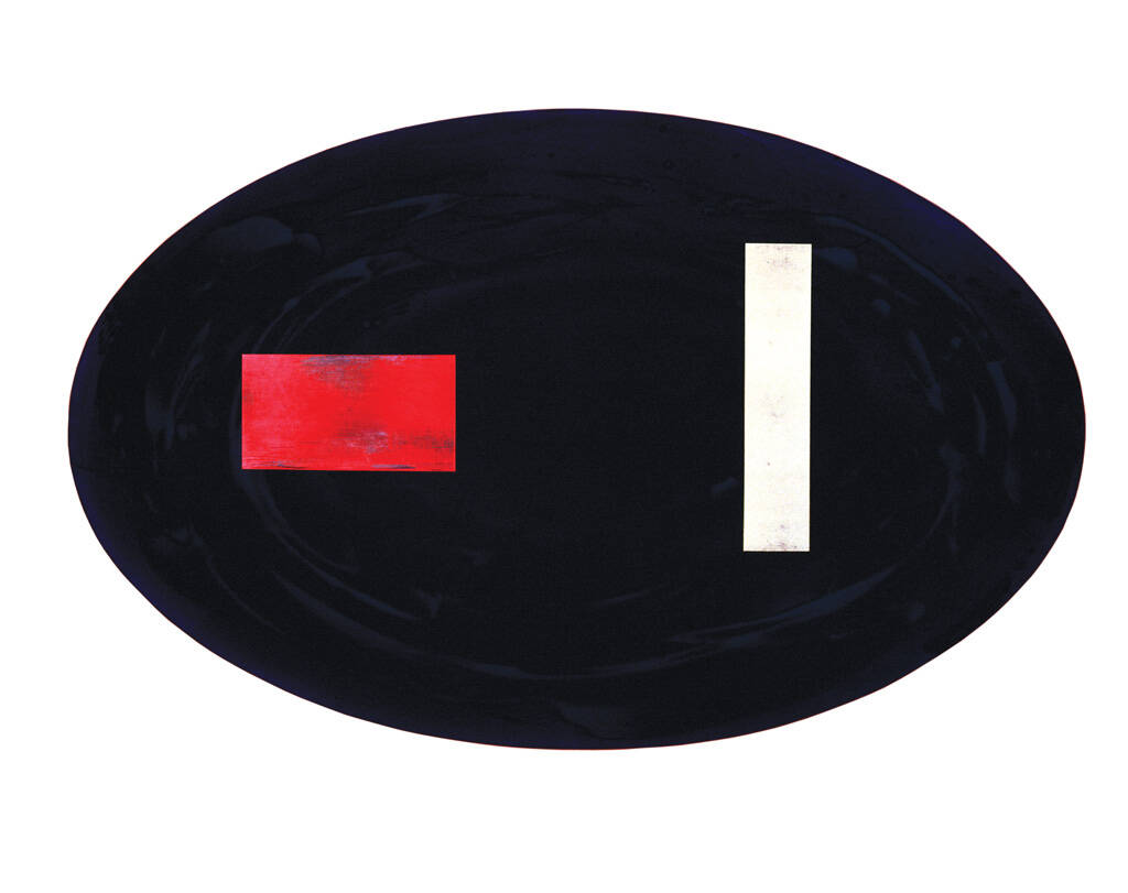
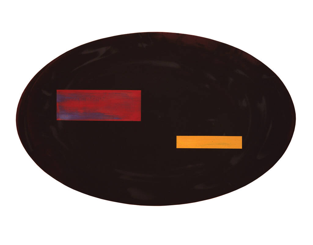
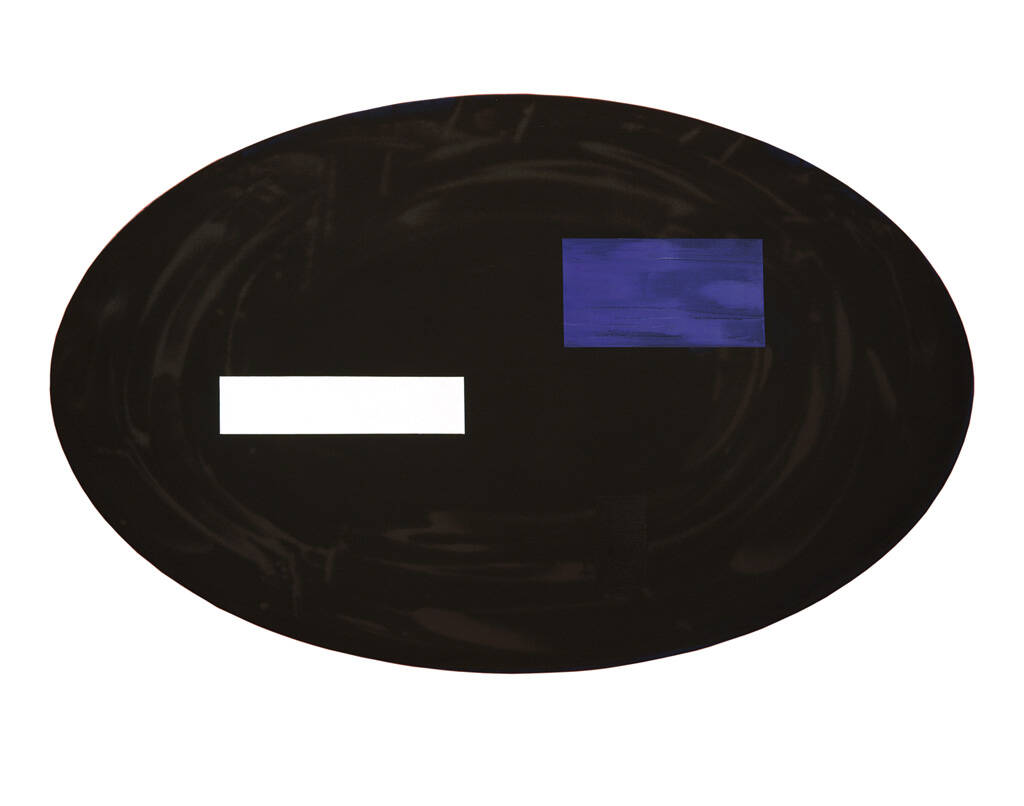
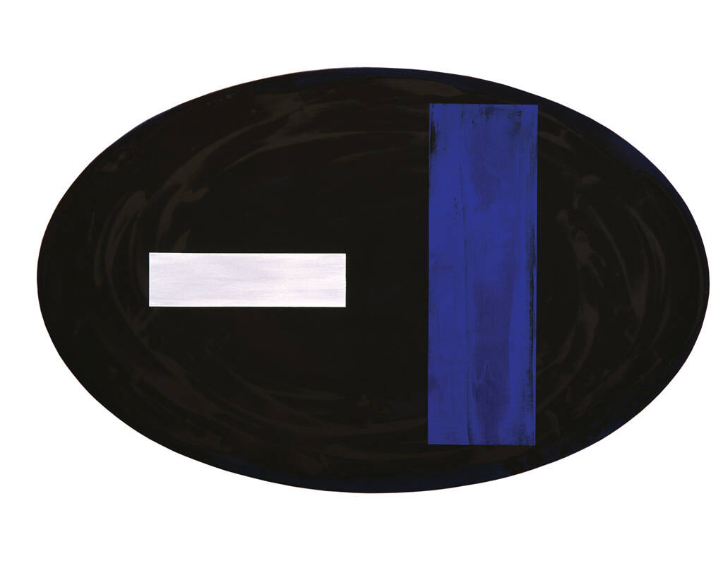
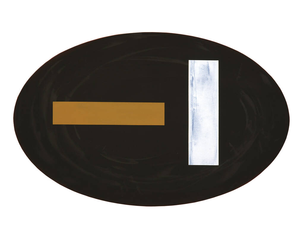
The oval came simply because I felt I needed to do paintings that weren't anchored to the floor. I was trying to find a shape that would sit with the hemisphere yet have its own integrity. I don't like circles. They’re masculine; they feel like targets, bullseyes. So, an oval. Dad made my first oval stretchers. They floated on the wall and almost reflected two hemispheres. I realised that I could say something in this shape that was quite different to what I wanted to say in the hemispheres. There might be similar movements of paint being pushed around, but I could speak in a different painterly voice.
The first ovals were ‘nocturnes’, to do with the night sky, and the next were the ‘nomadic geometries’ series. That refers specifically to the geometric lines or forms on the paintings. These forms wander; they're not in the same place in any painting. Sometimes I see them as up front on the painting, which they are literally, so that you step into, metaphorically, or over them. So your first hurdle, or first barrier, encourages you visually to move into the painting.
I see the geometries as musical notation: a chime or a sound transformed into a bar of silver or streak of gold, red, black, or other colours. When my friend Peter Shaw sent me ‘Orchestra: or a Poeme of Dauncing’ by the 16th-century poet Sir John Davies, I really responded to it. Out of that poem came Nomadic Geometries (Dancing Shall it Name), 1993 and many other titles for my ovals.
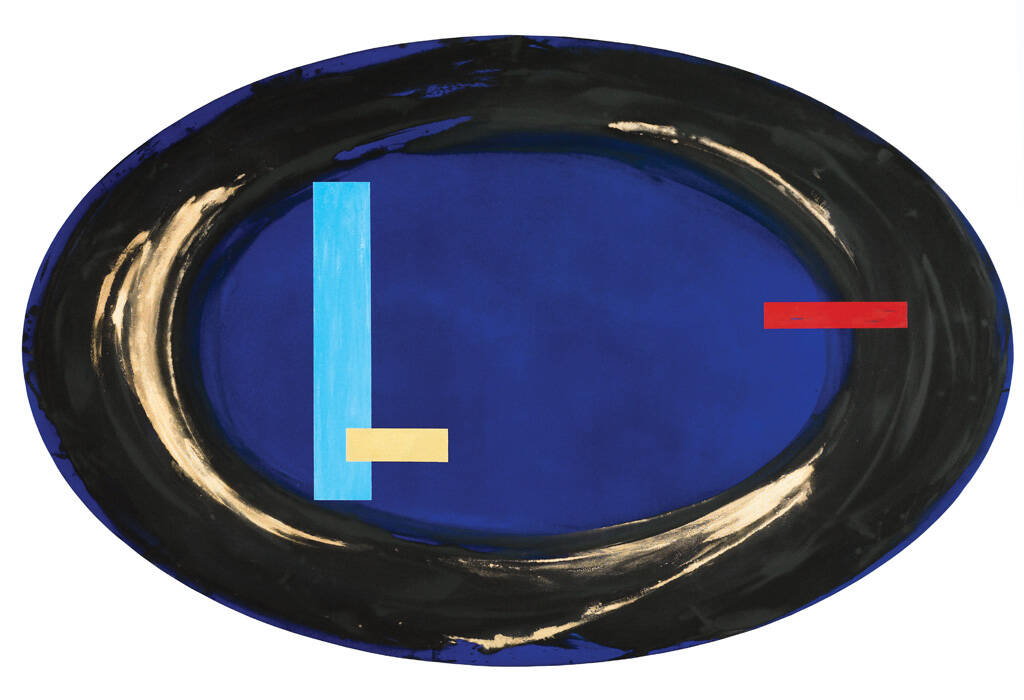
The geometries gradually became more refined. Now, they slide across, or lift above each other. Sometimes there’s just one, although not often. They provide a pause. They’re different from what they sit on: they're solid or brushy, whereas beyond might be watery. They draw attention to the painting’s surface. They introduce a geometric element into the organic. Mostly they’re oil paint: I brush the paint on and get a textural mood. They create balance. They divide the painting into parts. They draw attention to themselves and can either be in contrast to or in harmony with what they’re sitting on.
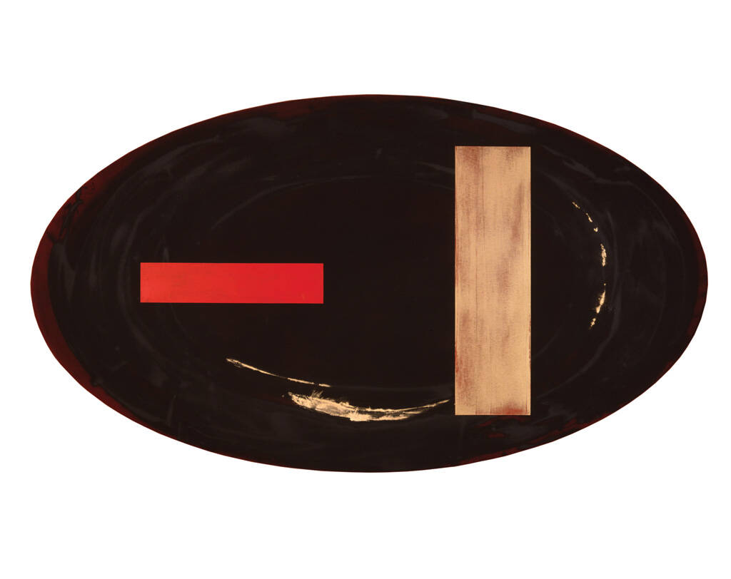
Because I’d originally used the rectangle, I wanted to synthesise the shapes of oval and rectangle. The rectangle is very strong with the oval inside it. I could flood the colour onto the raw canvas – like watercolours on paper. The effect was different to the crisp, cut edge of the oval. Flooding softened the edges and allowed them to feather.
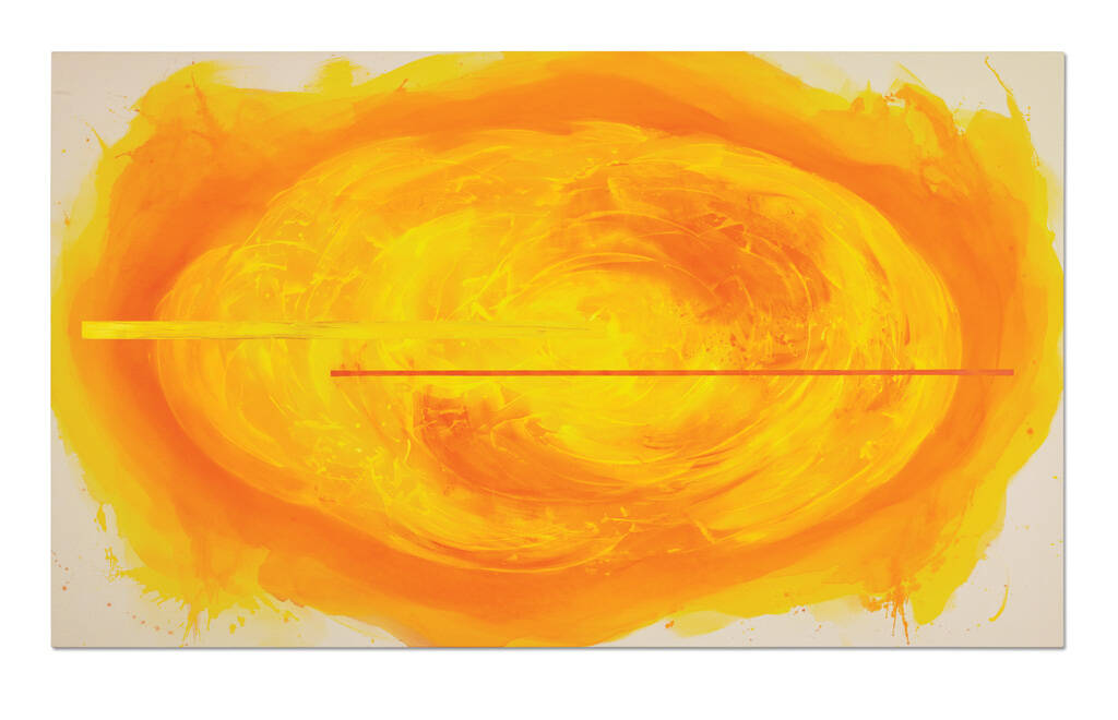
That led me to a transition, a moving through of ideas. I began working with structures composed of two parts so that there was a real join in the work – an allusion to my bolted hemispheres – except that now the structures were rectangular. I used the geometries to complicate the visual reading of those paintings. Sometimes they mimic a real dividing join where the bolts are holding the thing together. Geometries have multiple purposes. I like them! These large later works also refer to the seventies works because they have a sense of landscape. But they are something more – they’re very reflective; they have a different quality.
The hemisphere, the oval, the rectangle are the three shapes I've used and still use.
How do you apply your paint?
I build up many layers of thin acrylic in a colour that feels right to work on. At the moment, I've just put down a wash of raw sienna mixed with a sort of golden ochre, but it will dry too light. Tomorrow I might put over a darker wash which will give me a clue as to what I will do on top of that. How do I apply that? Well, if it's thin, I’ll use a brush or a sponge. If it's thick, I’ll push it around with a blade of rubber. I also use brushes, like house painters’ brushes. Some are soft, some are bristly. A speed brush, which Gordon Walters suggested to me years ago, is in my arsenal of tools. In the Illuminations works I cut stencils of ribbony shapes of paper, laid them over the painting and sprayed through the gaps. And then I poured water over that to wash most of the white out. So I just had a little flickery light.
Gesture and geometry – movement: your arm and your body are important especially because many of your hemispheres are nearly two metres high and wide.
Yes. That's how the painting is arrived at. The painting lies on the floor because the paint is thin and would run if the canvas were upright. Its shape determines my initial movement. In the hemispheres, you can see my arm, squeegee in hand, going back and forth in a rhythmic dance towards and away from the centre. In 1982, when Janet Frame saw my work in Whanganui, she sent me an article by the pianist Abby Whiteside in which she said, ‘Put a rhythm in your body and keep it going.’ She felt that phrase reflected that idea in my work. I get a movement with the paint while it's in its liquid form; it can't be too thin or too thick, it's got to be moved while it's flexible and it builds up a rhythmic pattern.
In the oval with its never-ending form, I needed to quell the activity of the paint with the horizontal lines which wander like nomads, but find their proper place. They provide stability and serenity and complement the paint’s movement. I work from all sides; skit around like a dancer or choreographer. Sometimes I go against the rhythm and return the paint in the opposite direction. You can see that in Old Velvet Moss, 2008. I've made the paint turn in on itself and come to a full stop. I don't finish a work in one go but complete a certain part of a painting and wait till it's dry. I’ll look at it on the wall, then the next day put it down on its back and continue on. In practical terms, I'm building up an image on a flat surface. I'll know when it feels right, and that will determine what I’ll work over. I don't pre-plan. Even my titles, which are very important, often don’t come to me until a painting is at a certain point – it might even be finished before I decide what to call it.
The answer to how long it takes to make a painting is: it takes a lifetime. You make it at a moment in time based on everything you've done before. How do you measure that?
Can we talk about series? In the monograph’s index the word ‘series’ occurs frequently: Garden series, Illuminations series, Mirrors and Lakes series, Nocturne series, Rose Gardens series. How are these different from other more specific series: Colloquy, The Seven Sorrows of Mary, In Memory of my Father, After Goya, and Eight Hours?
I think when you're on a roll as a painter and you're painting every day with ideas about the rose, for instance, a lot of rose gardens tumble out, and are differentiated with particular inflections of scale or geometry. The first couple of paintings give me enough of a response to feel there's more yet in them: to do more paintings. Then that runs its course, or something else comes along. These are more like progressions.
The specific series paintings are very specific; they’re profoundly significant, a finite group. The Colloquy paintings, 1984 are based on the ideas of Fra Roberto Caracciolo da Lecce, who was a 15th-century Franciscan friar. He believed that Mary experienced five spiritual and emotional or psychological states when the Angel told her she was to have a child, who was the son of God. I’ve painted them all. These states start with ‘disquiet’, which becomes ‘reflection’ when she thinks about the news, then ‘inquiry’, ‘submission’ and finally ‘merit’, when she accepts her new state.
The idea for my Seven Sorrows of Mary, 1995 came after a Catholic friend told me about a special rosary to be prayed to remember these sorrows.[2] My mind just filled with the image of seven black ovals: I could see giant beads strung around a gallery. I immediately painted the story of Mary, which was shown at Auckland Art Gallery in 2002 on a rusty red background.
What influences you?
I’m a woman, a wife, and a mother. I love my garden. I live close to the sea. Art history and architecture are important. This is all in the DNA of my work. For many years, we lived in a house that David Mitchell designed for us; we were surrounded by McCahon paintings. They also had influence.
You gravitate to things that affect you. Obviously, art – historical and contemporary art. You’re drawn to what you find in literature, music, poetry, history. Poets like Elizabeth Bishop or Emily Dickinson, who wrote her poems on unfolded envelopes which I found highly conceptual and visually arresting.
When we travelled as a family in 1978–79, we saw things for the first time: the Matisse Chapel in Vence, France, Cistercian monasteries in France, the Madonna del Parto in Monterchi. We visited the Rothko Chapel in Houston and the Donald Judd studio in Manhattan. Our eyes were widened by being out there in the world. These experiences hit the heart and the intellect at the same time and wrap themselves around you; give you sustenance.
If you are somebody who looks, listens and reads, everything is waiting for you.
-------------------------------------------
[1] Catharina van Bohemen, 'Laudemus The Eight Canonical Hours of the Divine Office & Gretchen Albrecht’s Eight Hours', catalogue essay, Gretchen Albrecht – Eight Hours exhibition, Two Rooms Gallery, Auckland, 2022.
[2] The Seven Sorrows of Mary are: 1. The Prophecy of Simeon and Anna; 2. The Flight into Egypt; 3. The Loss of the Child Jesus; 4. The Condemnation of Jesus; 5. The Crucifixion; 6. The Deposition, or Retrieval of Jesus's body from the Cross; 7. The Burial of Jesus. Simeon, in the title of Albrecht's first sorrow, is the name of an old man who predicts that the child Jesus would ‘cause the fall and rise of many in Israel', and that a sword of sorrow would ‘pierce’ Mary’s soul ‘so that the thoughts of many hearts would be revealed'. Luke 2:25–25.