Before I met John Nixon I had already seen John Nixon. John was the subject of a portrait by Jenny Watson that was exhibited at Georges’ Gallery, Melbourne which was on the upper floors of the department store. John was placed like a Barrett Newman stripe in the middle of the canvas wearing an altogether colourful shirt with exotic birds and foliage and faded blue jeans. He was placed in a monochrome of bright Cadmean yellow. The thrilling austerity of the background, a gesture to John’s own chromatic minimalism, inspired me to go home and paint a series of similarly reduced works. I got low grades for the effort. I think this was 1975.
A bit later, when John visited the Arts Bookshop, a famously important place for all artists wanting the most recent international magazines and journals, flown in at high speed and cost by the proprietors Elly Fink and Gilda Rudzki, and where I worked, he cut a dash in a Mao blue outfit of coveralls. Minimalist, monochromatic. The uniform was an indication that he was a man at work pursuing his diligent modernism in a labouring kind of unheroic approach. He was always dressed the same and I was taken with the singularity of his sartorial statement.
It became clear that certain artists always wore the same thing. Robert Rooney a plain pressed shirt with ordinary pants; Aleks Danko, also inclined to Mao blue, dressed in coat and workman’s cap; Howard Arkley had a jaunty striped blazer, school type, and so forth.
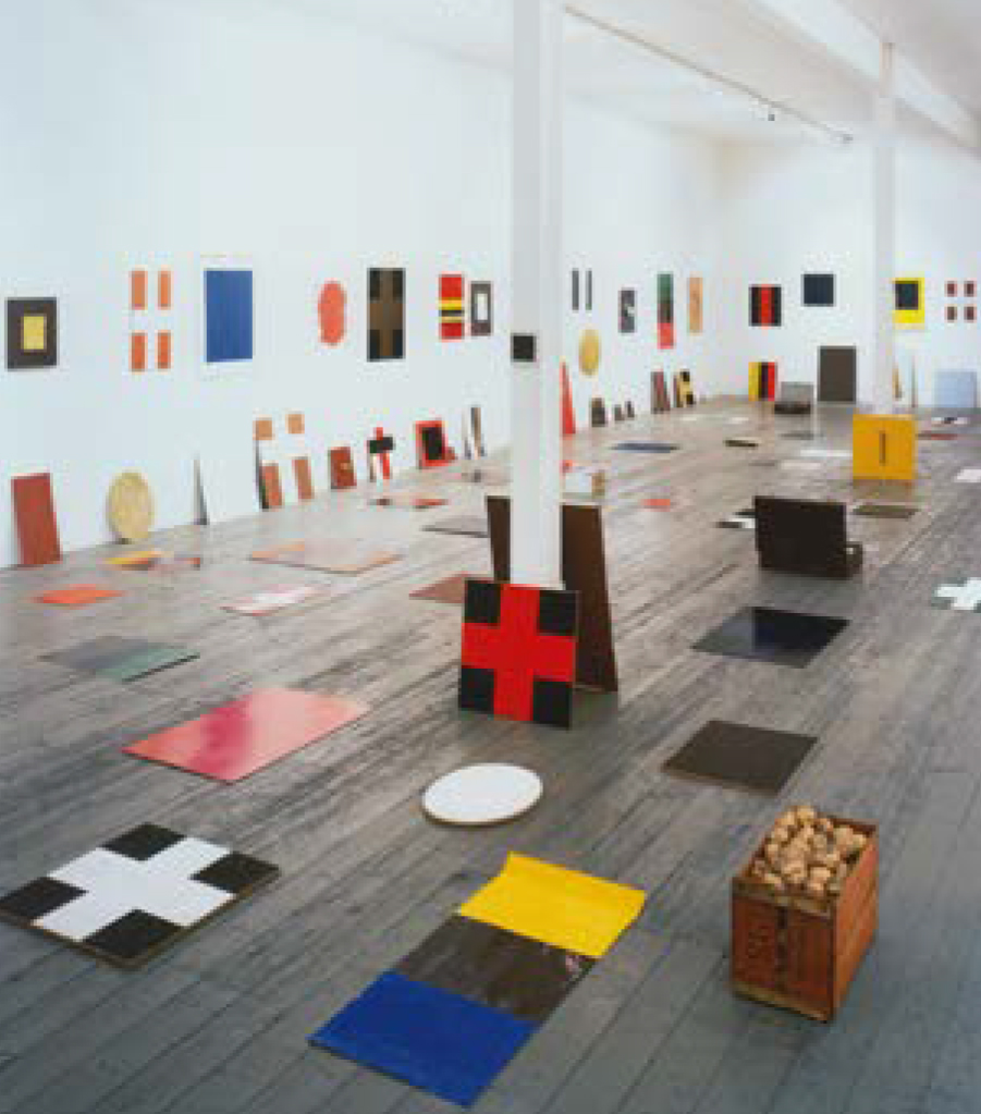
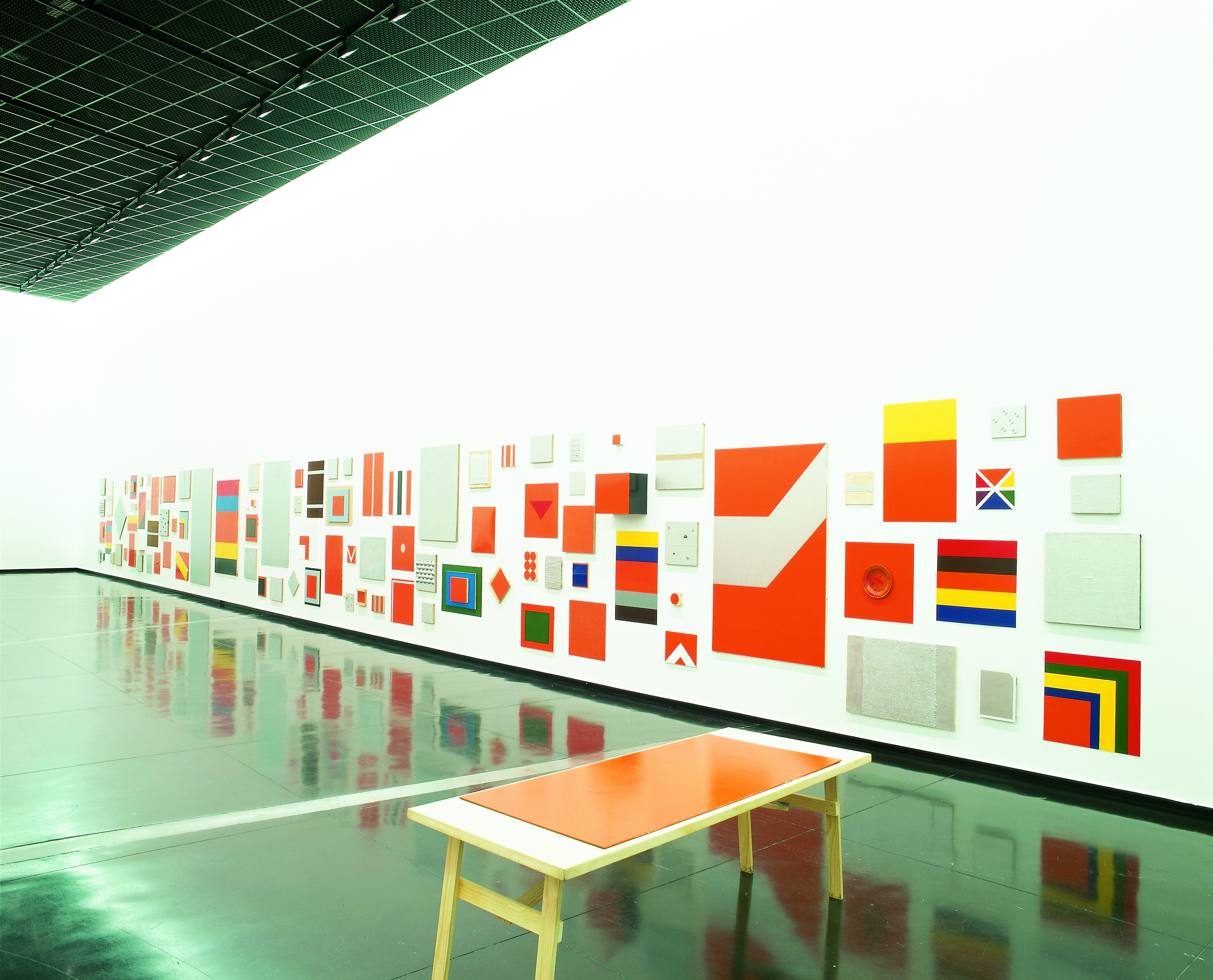
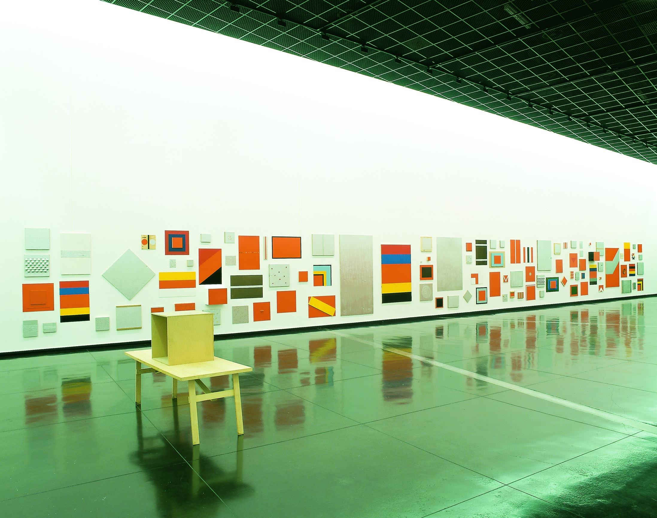
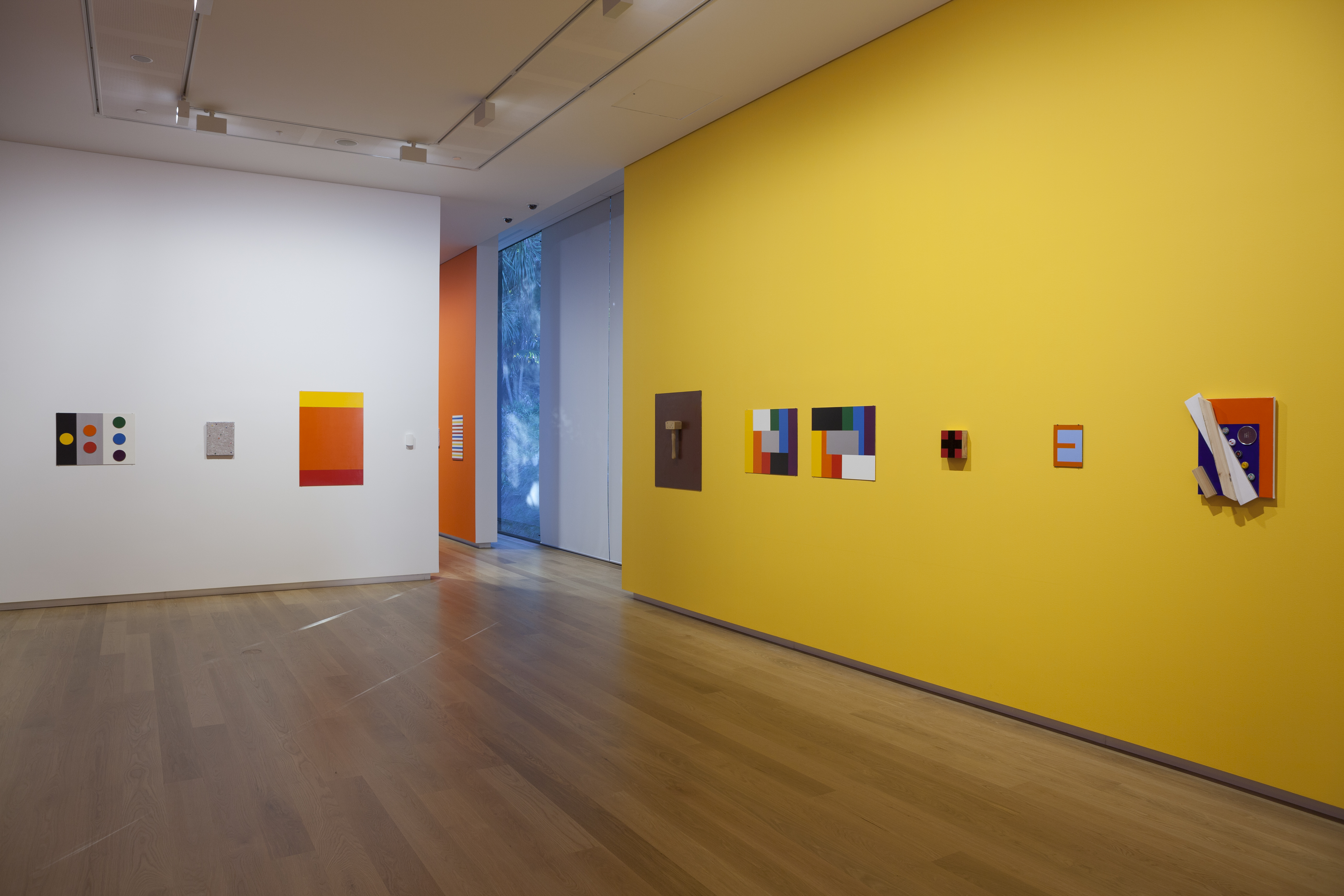
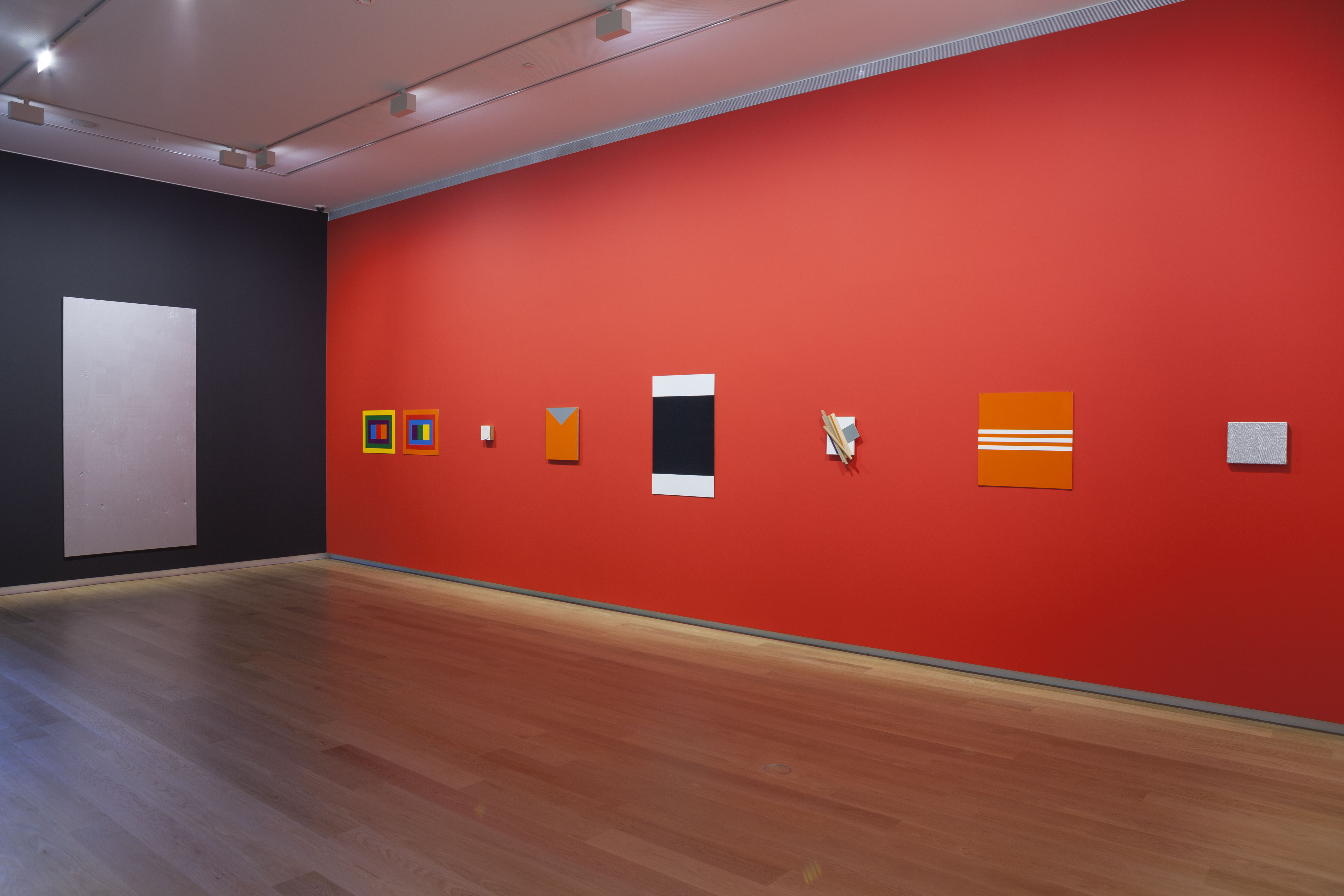
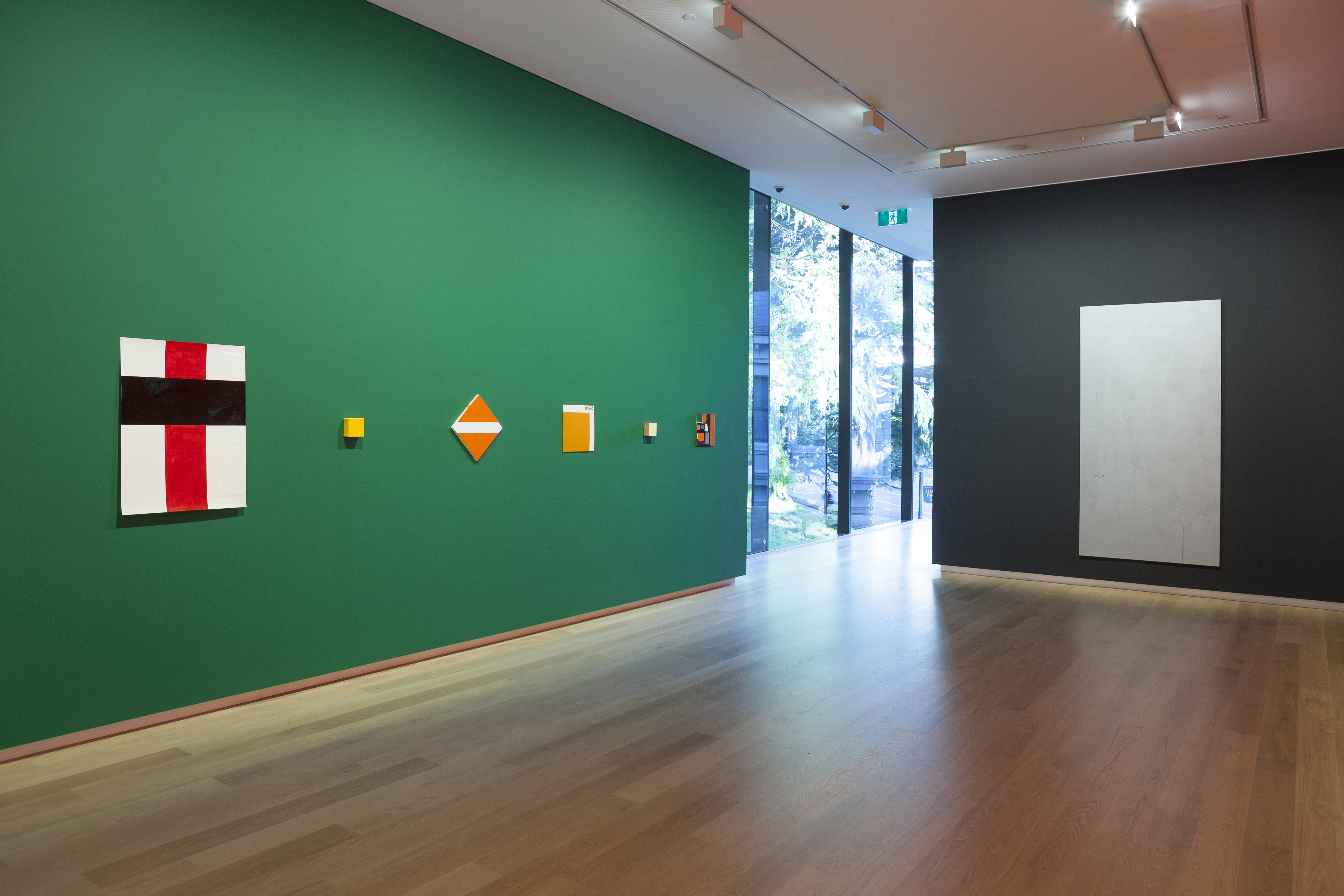
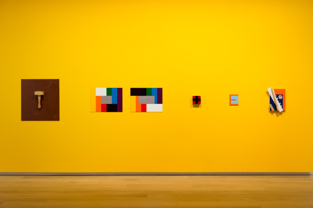
Even though John was from Sydney, he was part of a push that curator Daniel Thomas called Melbourne Cool. Artists collected around him like the planets of our solar system do the sun, drawn into his charismatic definition of art and life, work and life mantra and example. They were not necessarily all striving for the quotidian modernism that John followed. One of his great qualities was his support of many different approaches. But the underpin was conceptualism.
I wrote a review of John Nixon’s work in the first issue of FASS, our university attempt at engaging with contemporary art. I made it a string of reference words, all in upper case. I tried for an alphabetic precession . . . CATHOLICISM, CONCEPTUALISM, CONSTRUCTIVISM, CRUCIFIX, MALEVICH, MODERNISM, and so forth. I was pretty nervous about it. When Paul Taylor asked me to come work with him on Art & Text he told me John thought it the best review of his work thus far. I was very encouraged by that. Paul also asked me what I thought about John’s work. Was he a Romantic, a Postmodernist, a Modernist, a Conceptualist, a Minimalist, a Dadaist? I said I thought he was all those things, but in particular I thought he had a romantic approach to the anti-romanticism that formed the basis of his radical modernism. I still think that’s true.
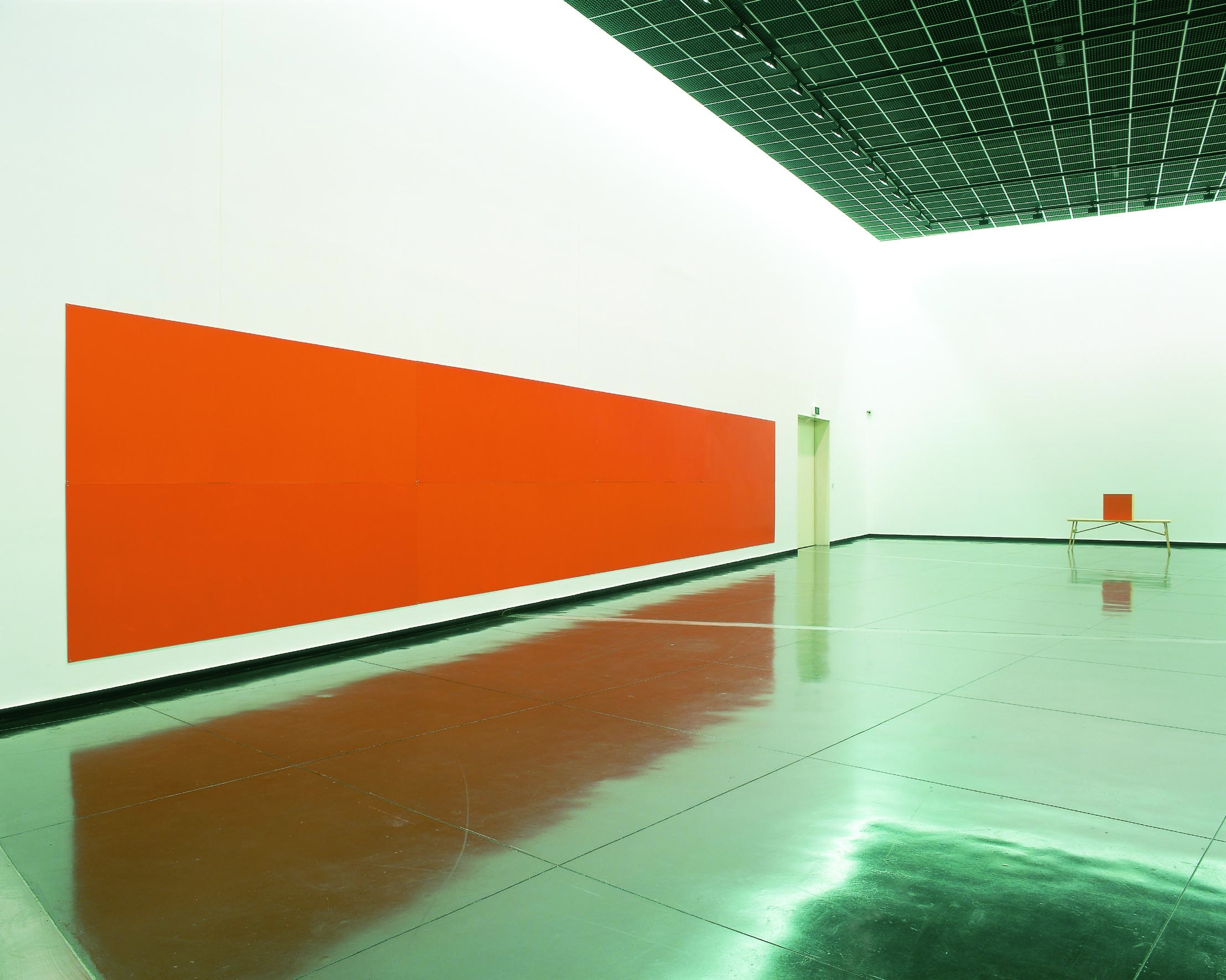
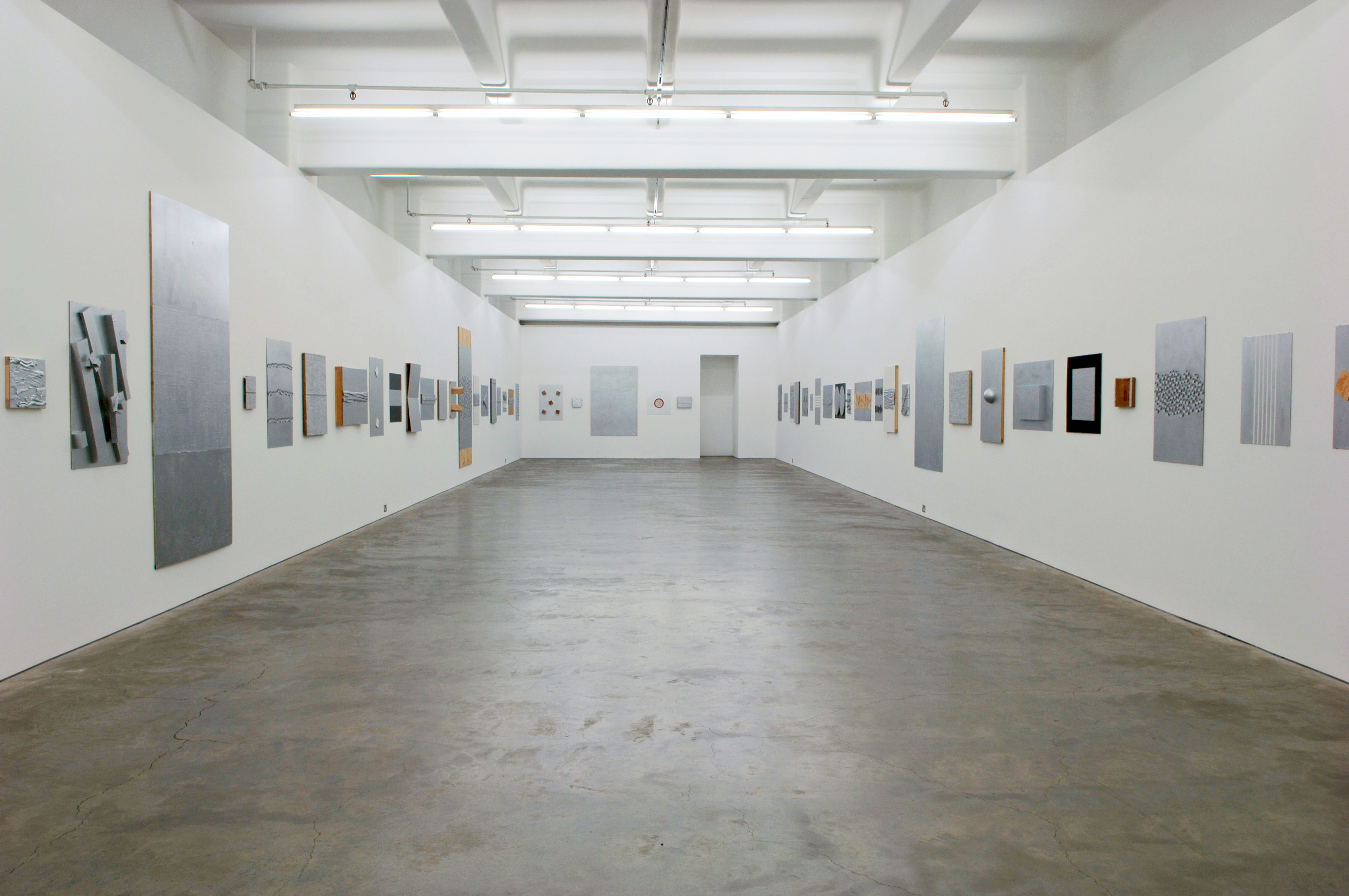
Even though the work-to-rule formulas remained steady and sturdy throughout John’s output his work could also accommodate certain theoretical drifts. When postmodernism was at its high point and music had taken a New Romantic turn, John’s monochromatic project provided a platform for the found object and was briefly embraced by the postmodern flip.