Olivia Boswell: Tell us about your work, Frequency.
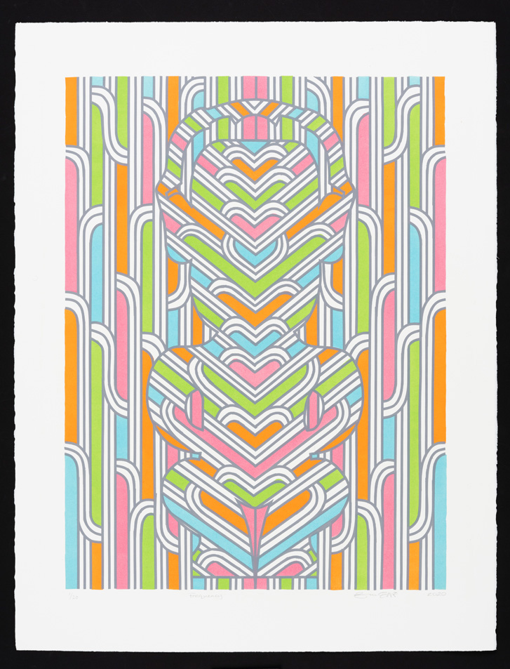
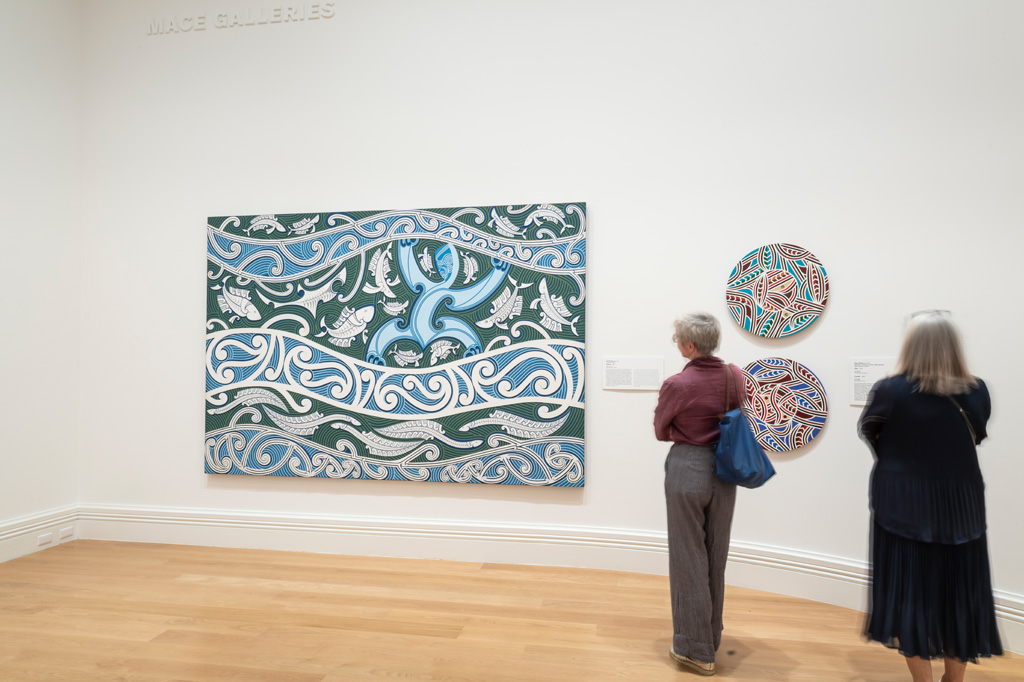
Zena Elliott: The lithograph Frequency explores forms that exist in whakairo (carving), the haehae (parallel grooves between lines of the pākati (dog-tooth) pattern in carving) and a tekoteko form (carved figure on the gable of a meeting house). The haehae is used to create form, depth of field, repetition, colour and symmetry. A common device in this design is to turn the ridges so that they cross the strip of pākati and meet the first ridge on the other side. This is known as whakarare (distortion). However, the space where you would normally have pākati is simplified to pure abstract form that is enclosed with three lines that communicate the past, present and the future. These lines co-exist within the same space and are not a linear series of events. When these connect with the bottom or top row of lines, it creates a space that encloses particular historical events, narratives and ideas that are represented through colour. The brightly coloured printing combinations act as beacons or a light in the dark, a signal for location and visibility.
Colour is an important aspect of my creative art practice; a Māori word that can best describe my work is ‘haukura’, which when translated means ‘neon’. It refers to gas (neon being a colourless, odourless gas) or intangibility, and within the context of this artwork it is wairua (spirituality). ‘Hau’ is air, breath, vital essence, to be heard, resound, spread (news). ‘Kura’ is all the bright, precious, stunning qualities, attributes, artifacts, items, treasured things, whakapapa, stories, symbols on which we put tangible and intangible value.
Frequency incorporates these concepts through an array of electric waves of colour that play on tone through colour theory and philosophy. The design draws inspiration from customary artforms, but incorporates a technological device from this era, such as Bluetooth headphones, and is a reflection on Māori society today, where the use of technology is incorporated into our way of life.
OB: What is the process of making a lithographic work?
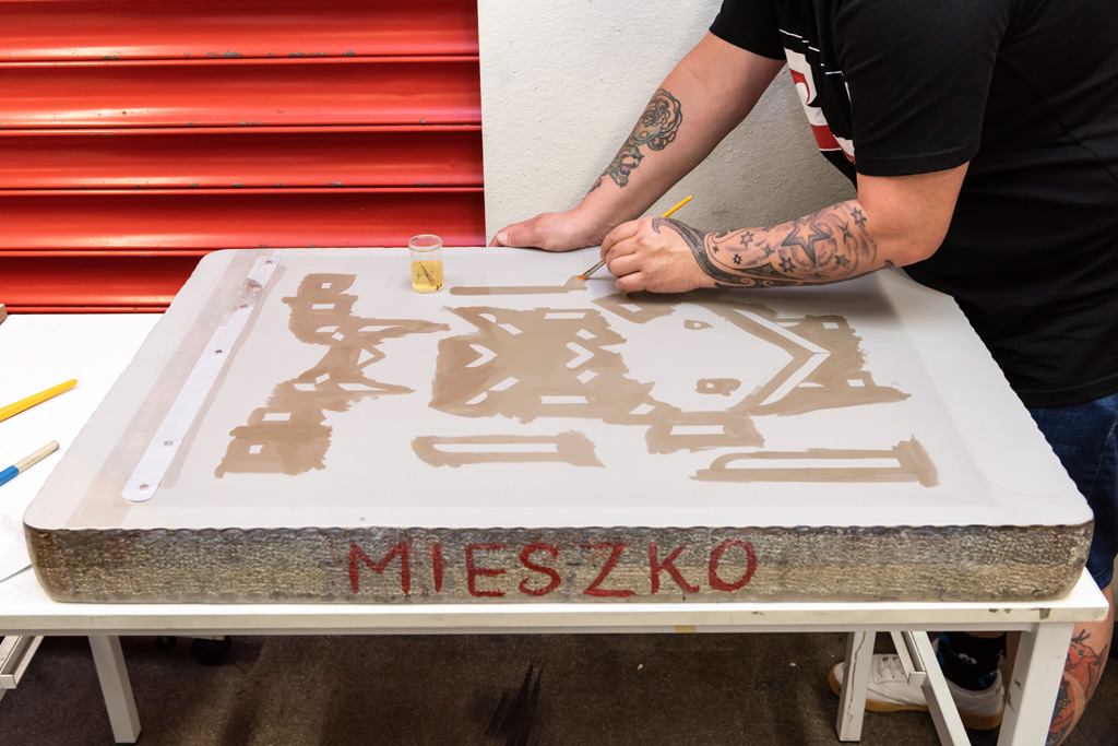
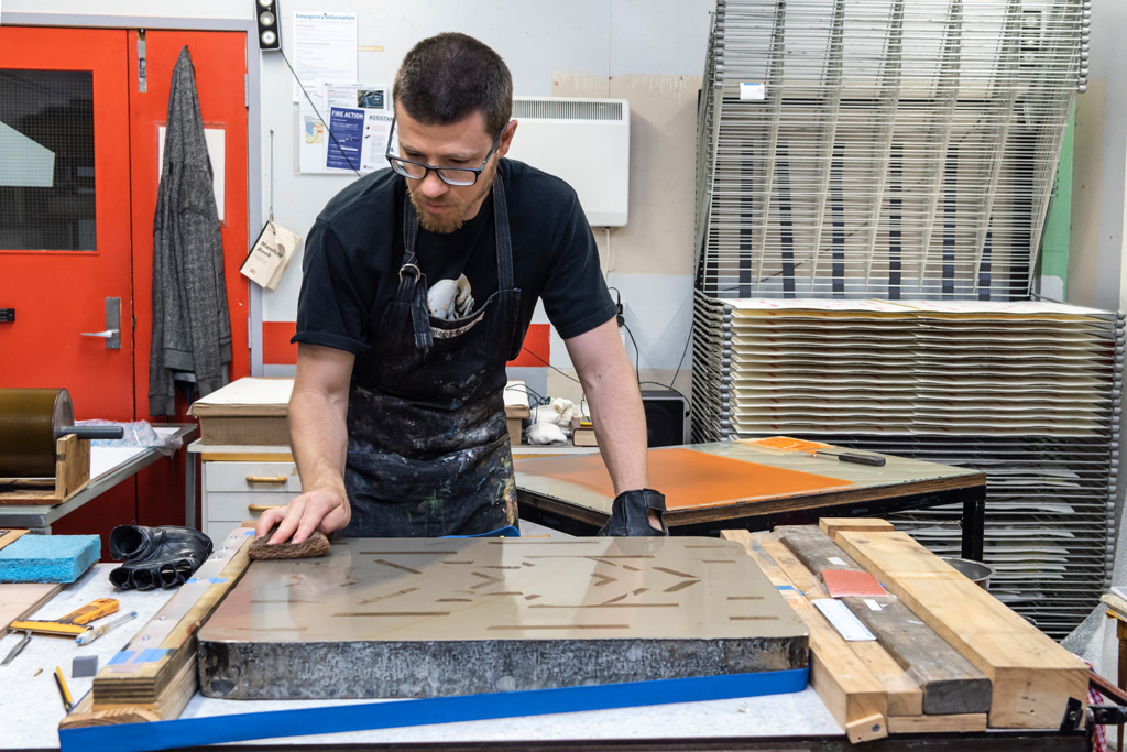
ZE: Creating a lithograph involves working directly onto an ancient limestone. My creative process for painting usually involves masking, which gives a hard edge to the design. However, for the lithograph I had to use a combination of freehand painting, using a gum and an oil-based solution. During this process I was informed and guided by John Pusateri, of Auckland Print Studio. He was a great teacher. At first, I found it was a complex design to translate through lithography, because every part of the design that was applied to the stones had to slightly overlap the previous layers, there was no room for gestural mark-making or creative exploration.
OB: How did you come to make a commission for Auckland Art Gallery’s Shop?
ZE: I was approached by Emma Pritchard from the Gallery’s Shop about making a series of limited edition lithographs as a commission, in collaboration with John Pusateri. The collaboration was carried out over a few months. I travelled to Auckland from Hamilton weekly, when able to between Covid-19 lockdowns – where design preparations were achieved and discussed. John is well known within the printing sector – a lot of my Hamilton friends knew of his work and expertise so I was very grateful to be able to work with him. Given the challenges faced during lockdown, we managed to create some excellent prints.
OB: How did you conceptualise the work?
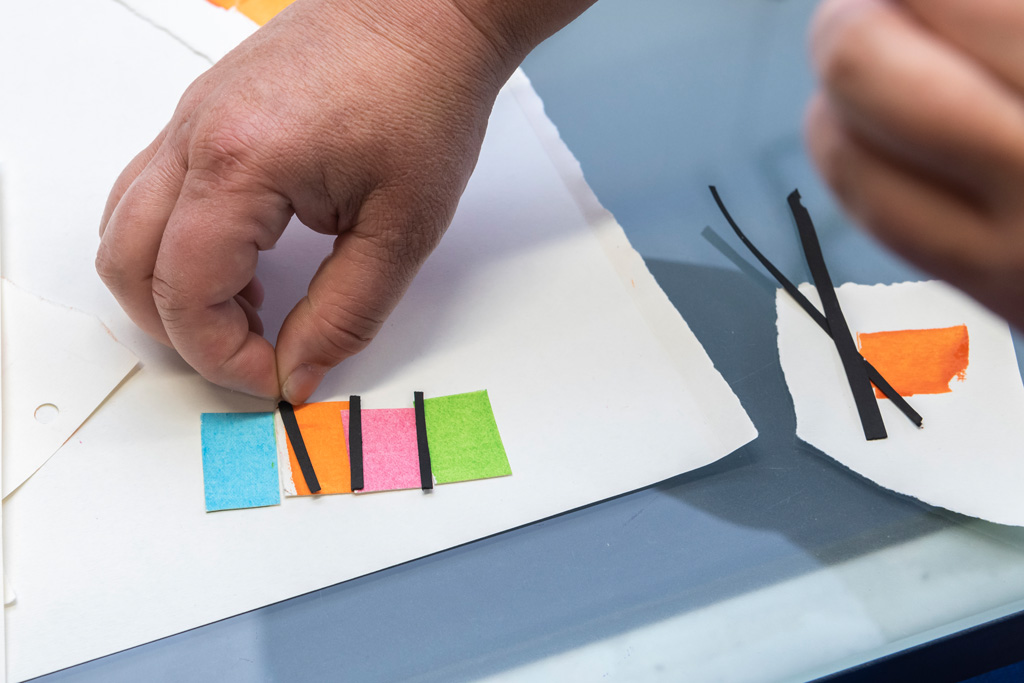
ZE: I was able to conceptualise the work by understanding the printing process and various techniques used in printing. I also researched examples of lithographs and found that the flat, layered style that I often incorporate into my work was uncommon in lithography. To finalise the print design, I focused on my previous works for inspiration and came up with a design that references the forms, patterns and colour combinations I am known for.
OB: This your first use of lithograph. Will you continue the practice?
