Seeing in colour: Eight artworks, eight moods
Explore how colour shapes mood, emotion and meaning in art through eight artworks from Auckland Art Gallery Toi o Tāmaki’s collection.
Main image credit: Peter Robinson, Rainbow Straight (detail), 2018, anodized aluminium, Chartwell Collection, Auckland Art Gallery Toi o Tāmaki, 2018
Can a colour change how you feel about an artwork before you’ve even worked out what you’re looking at?
Most of us already have our own associations with colour. Red might feel urgent or romantic; blue calm or melancholy; yellow cheerful, or perhaps a little overwhelming. These connections can come from nature, culture, personal experience and the meanings we’ve absorbed over time.
Researchers have found some surprisingly common patterns in the emotions people associate with different colours. But it’s not as simple as assigning one feeling to every shade on the colour wheel. A bright, saturated red can affect us differently from a muted one, while the meaning of a colour can change according to where, when and how we encounter it.
Artists have long understood this. Colour can attract our attention, establish a mood, create tension, carry symbolism or completely change the way we experience a subject.
So, what happens when we use colour as our way into an artwork? Next time you’re looking at an artwork, try noticing colour before you read anything about it. Which colour did your eye find first? What mood did you associate with it? Where else does it appear in the work, and what changes when you look at the colours around it?
We’ve picked eight works from the Auckland Art Gallery Toi o Tāmaki collection to explore the spectrum – and the very different things artists can do with it.
Black: Untitled by Gordon Walters
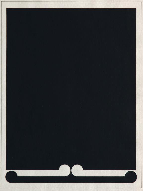
Black can carry some weight. It is commonly associated with darkness, sadness and power, but place it beside white and contrast takes over.
In Gordon Walters’ Untitled, 1973, black is part of a precise abstract composition painted in gouache on paper. Walters is one of Aotearoa New Zealand’s most recognised modernist artists, known for his exploration of geometric abstraction and the koru form.
Rather than reading black in isolation, look at what happens between the colours. Where does your eye land first? Does one colour appear to push forward while the other recedes? And how does that change the longer you look?
White: Grey morning, homestead near Parramatta by Amsdell
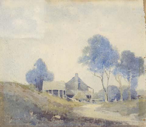
White might sound like an unusual choice for an artwork called ‘Grey morning’, but look closely and it’s doing much of the work in creating the atmosphere.
In 19th-century landscape painting, artists often mixed white into other pigments to soften their intensity, turning stronger earth tones into pale greys, muted blues and silvery shades. In Grey morning, homestead near Parramatta, that restrained palette captures the diffused light of an overcast morning, without the sharp shadows or strong contrasts of direct sunlight.
White also helps create a sense of depth. Lighter tones in the sky and distant landscape make the background appear to recede, while brighter highlights give definition to details closer to the viewer. Rather than representing one object, white moves throughout the painting as light, mist and atmosphere. The result is a landscape that feels hushed and still.
Red: Madonna and Child by Marco d'Oggiono
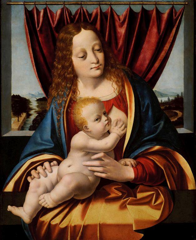
Studies have associated red with some of our most heightened emotions, both positive and negative, from love and desire to anger and power. In art, its symbolism has also shifted considerably across cultures and centuries.
Marco d’Oggiono’s Madonna and Child, painted around 1490, takes us to Renaissance Milan. D’Oggiono was closely connected to Leonardo da Vinci – he was staying in Leonardo’s house in Milan in 1490 – and Leonardo’s influence can be seen in the composition of the figures.
Here, colour belongs to a much larger visual language. Clothing, gesture and composition all helped contemporary viewers understand who they were looking at and the religious significance of the scene. For a Renaissance viewer, red could carry meanings far beyond its visual impact. In Christian art it was associated with the Passion of Christ, while richly coloured red fabrics could suggest status and value.
Blue: Mark and David Graham, 18 November 1997, Ngatokimatawharua, Ngapuhi by Ross T Smith
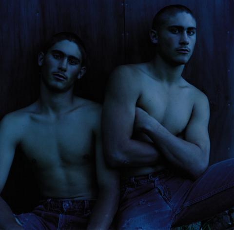
Blue has a reputation for calm, and across colour-emotion research it is commonly connected with positive emotions, but it can just as readily suggest distance, melancholy or introspection.
Ross T Smith’s 1998 photographic portrait Mark and David Graham, 18 November 1997, Ngatokimatawharua, Ngapuhi gives us an interesting way to explore it
Smith, who is Ngāpuhi, photographed Mark and David Graham as part of a wider body of portraits. Look at how blue operates within the photograph itself. What does it bring to the figures, setting and overall tone of the image?
Green: When Two Directions Become All Directions (Green) by David Thomas
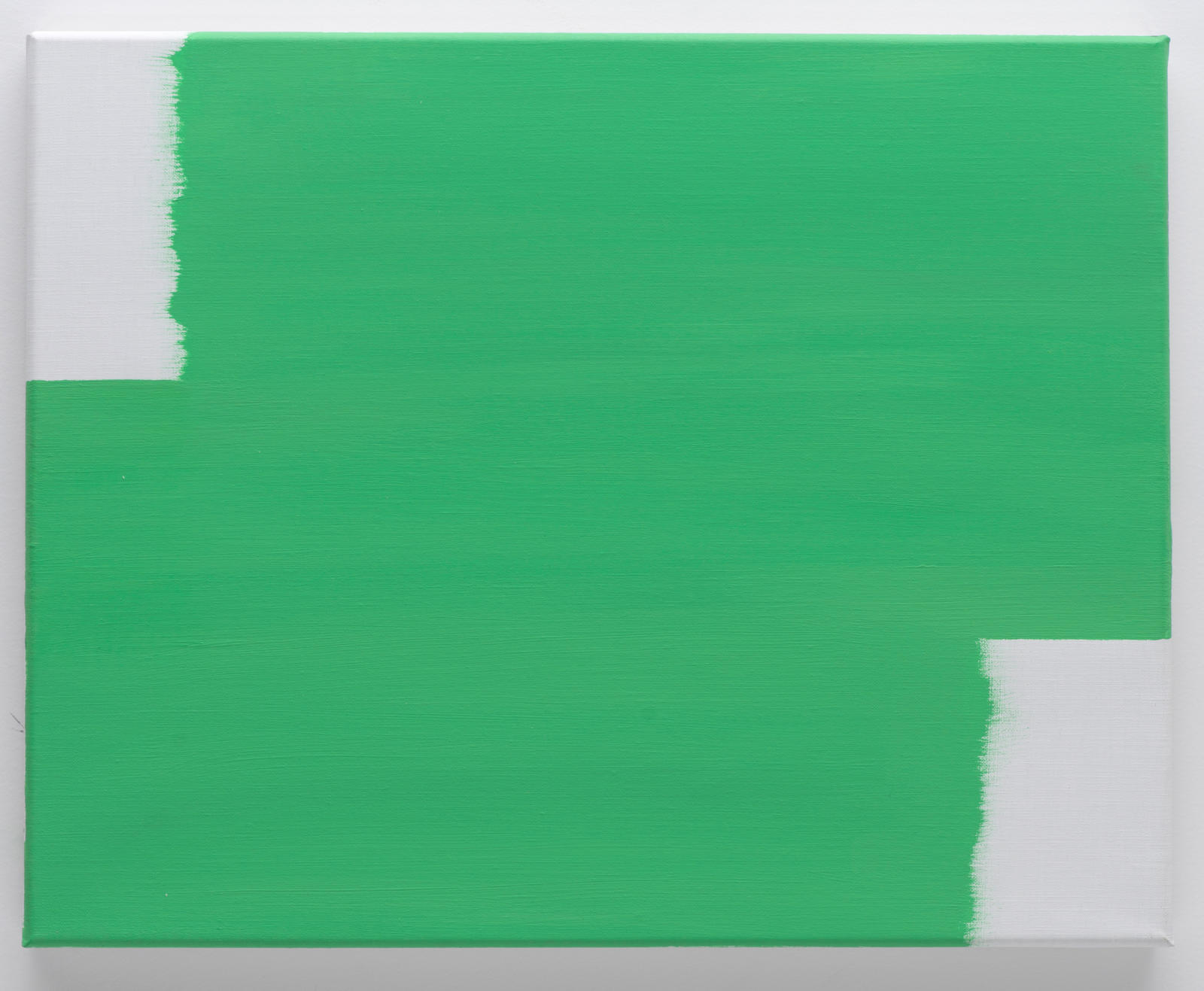
Green arrives with plenty of associations: nature, growth, renewal, safety. But what happens when an artist removes almost everything else?
In David Thomas’s When Two Directions Become All Directions (Green), 2014 there is no landscape, figure or recognisable object to guide our interpretation. Instead, the monochrome makes colour itself the subject, asking us to spend time with the material reality of green paint on linen as well as the meanings we bring to the colour ourselves.
For Thomas, the monochrome is also a way of slowing down perception, something that encourages us to become more attentive not only to the artwork, but to the light, space and changing conditions around it.
What initially appears to be a remarkably simple green painting becomes an invitation to spend longer looking – at the colour, the surface and eventually beyond the edges of the work itself.
Yellow: No.13 Yellow Painting by Philip Trusttum

Research commonly connects yellow with positive, high-energy emotions, which makes sense for a colour associated with sunlight and brightness. Yet yellow can also be intense, acidic or unsettling depending on its shade and surroundings.
Philip Trusttum puts it front and centre in No.13 Yellow Painting, a large oil-on-board work from 1971. And at 142 centimetres tall, the colour occupies substantial physical space.
That scale is a useful reminder that our response to colour isn’t only about hue. Saturation, scale, material and what surrounds it all play a part.
Purple: Sleep (Black Violet) by Dan Arps
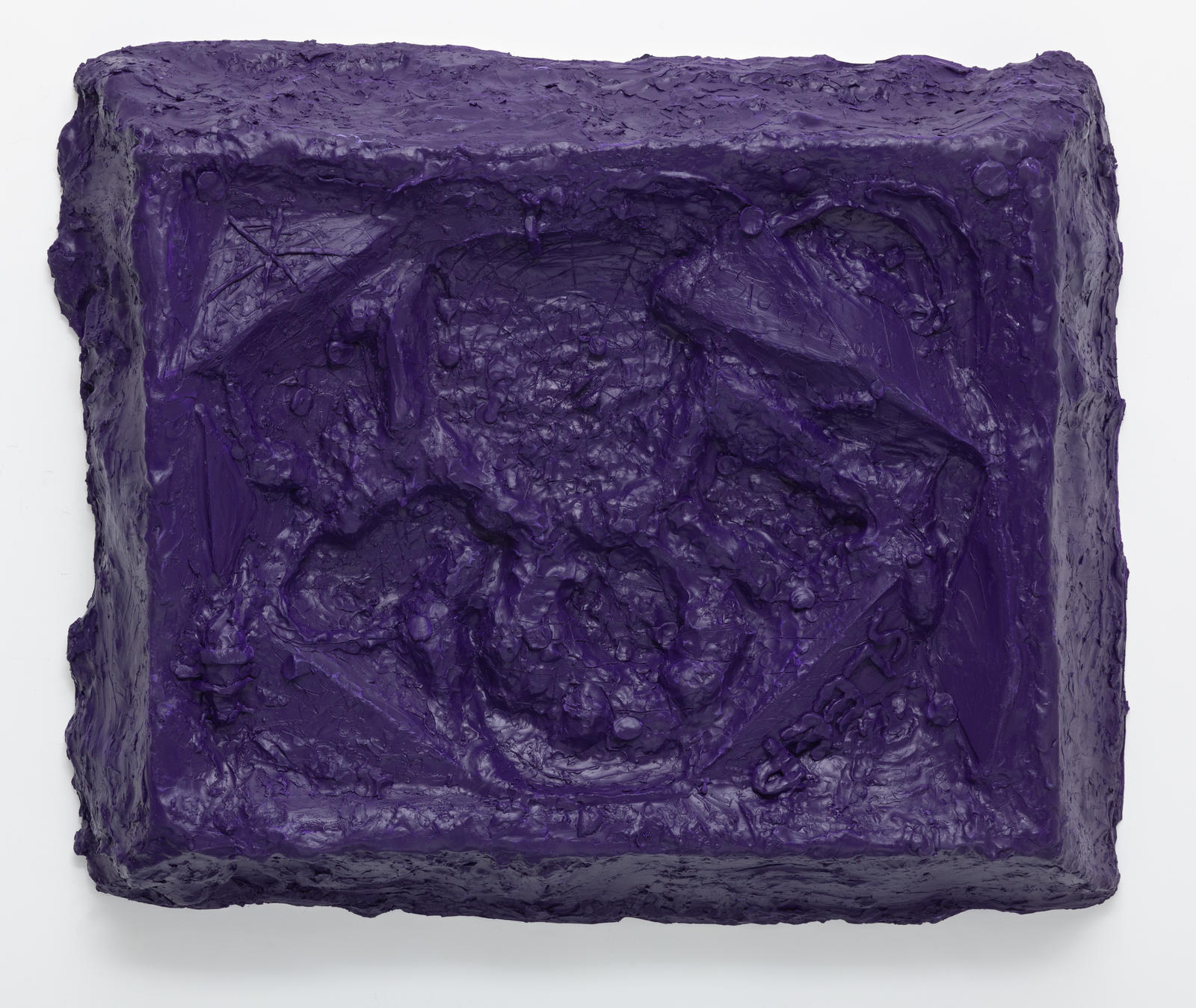
Purple has never been short on associations. Historically difficult and expensive to produce, purple dyes became closely connected with wealth, royalty and status. The colour has also accumulated more mysterious associations over time, linked with spirituality, imagination and creativity.
But there’s a big difference between a bright violet and a purple so dark it approaches black. That distinction feels important in Dan Arps’ Sleep (Black Violet), 2017. Made from polyurethane resin, polystyrene foam, acrylic paint and aluminium, the work takes a colour that can suggest richness, spirituality or even tranquility and pushes it somewhere murkier.
Even the title complicates our response to the colour. Sleep might suggest rest and stillness, yet ‘black violet’ feels heavier and less soothing than the softer purples often associated with spirituality and relaxation.
It also raises an interesting question for colour theory: when does purple stop feeling like purple? As violet moves closer to black, the associations we bring to it begin to change too.
Orange: The view from the top of the cliff by Colin McCahon
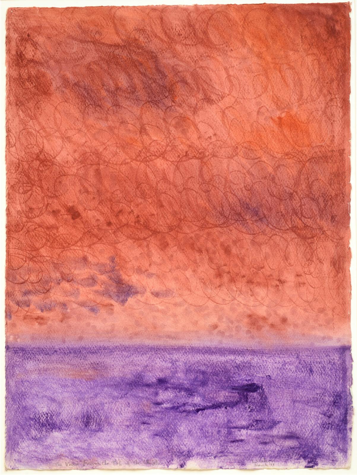
Sitting between red and yellow on the colour wheel, orange shares qualities with both. It can feel warm, energetic and optimistic, with colour psychology commonly linking it to excitement, enthusiasm and attention. It’s also a colour we know well from the natural world, particularly in the fleeting light of sunrise and sunset.
That connection is quite literal in Colin McCahon’s The view from the top of the cliff, painted in 1971 after the artist moved to Muriwai on Auckland’s west coast to paint full-time. Across this series of watercolours, the landscape is reduced to powerful bands of land, sea and sky, with an orange wash capturing the changing light McCahon observed from his cliff-top surroundings.
Orange therefore does several things at once. It describes the light of a Muriwai sunset, brings warmth and energy to the landscape, and draws our attention towards the meeting point between darkness and light.